Role: Product Designer
Task: Create and Design new AI Resource Center
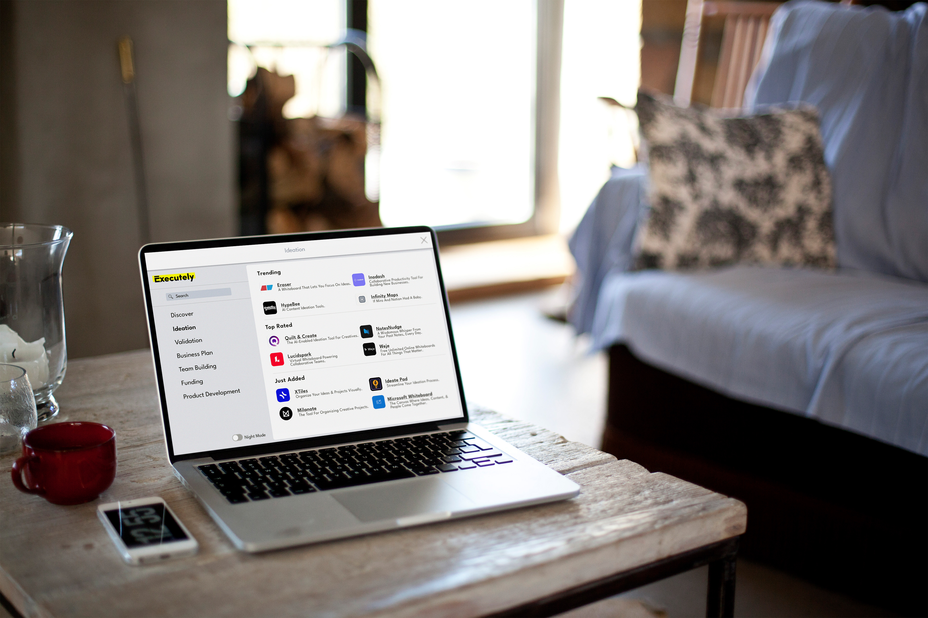
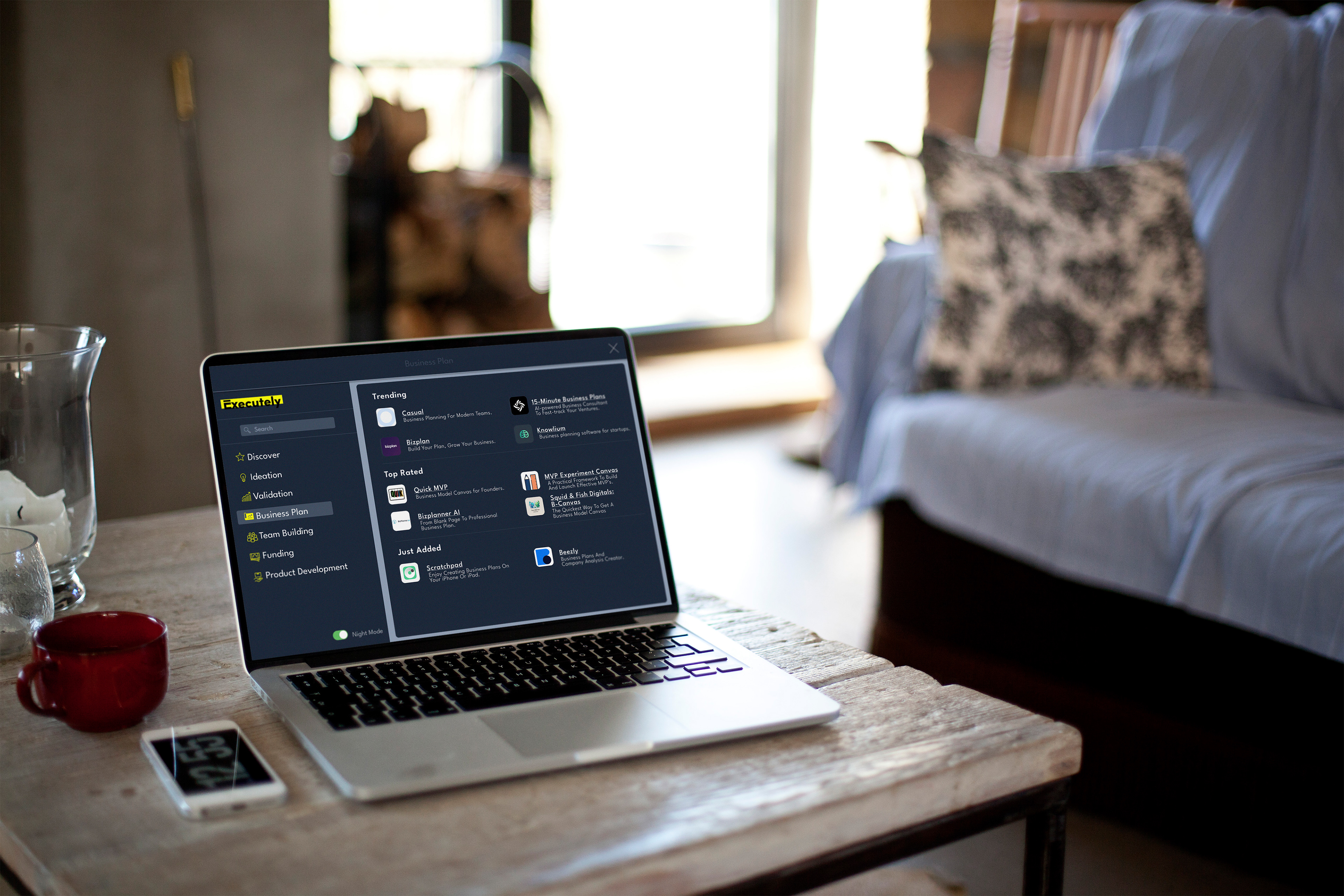
Executely helps startups map out their initial journey and provides startup teams with the all-in-one task management solution they need to stay focused on high quality execution.
Consumer Pain points:
• Want recommendations of tools I could use and instructions for specific tasks
• I like the clean lines; maybe wish for something a little less cold
• I like dark websites; ChatGPT has a nice dark mode; I generally like things to look nice (eg:
Apple)
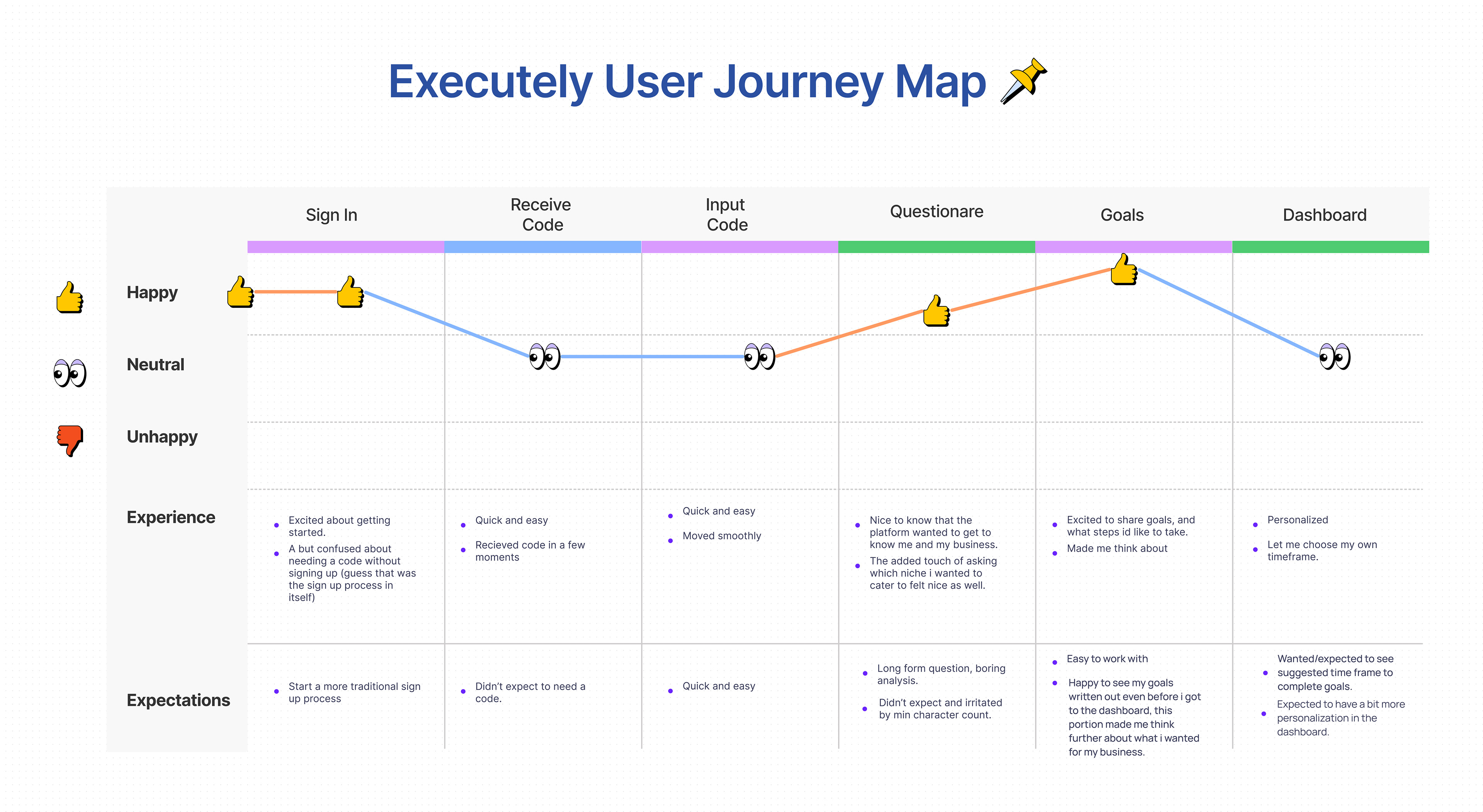
Before getting started, we were able to identify the consumers' pain points. Keeping those pain points in mind, we were able to journey map the product and share our own experiences. This part was especially important because were able to empathize with the consumer as well as see what their highs and lows are within the experience of the product.
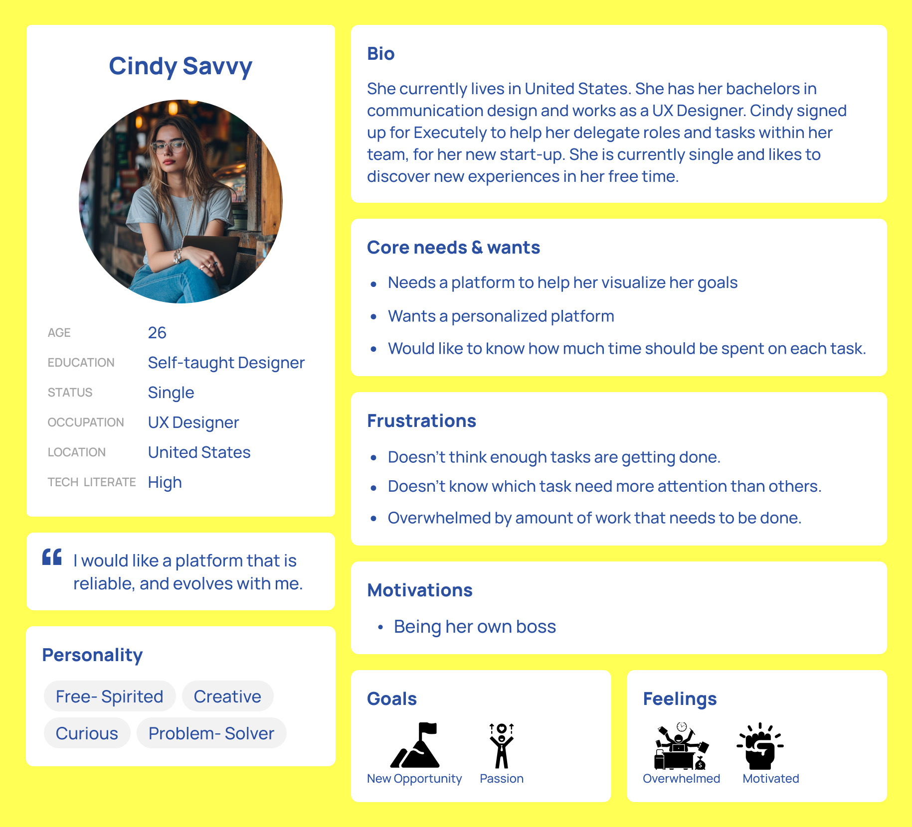
Already in the consumer mindset, we then created personas. Once again taking the information and results we gained through research and testing. This was especially helpful when we finally were able to design. While designing I was able to look back on this important information to keep myself on track.
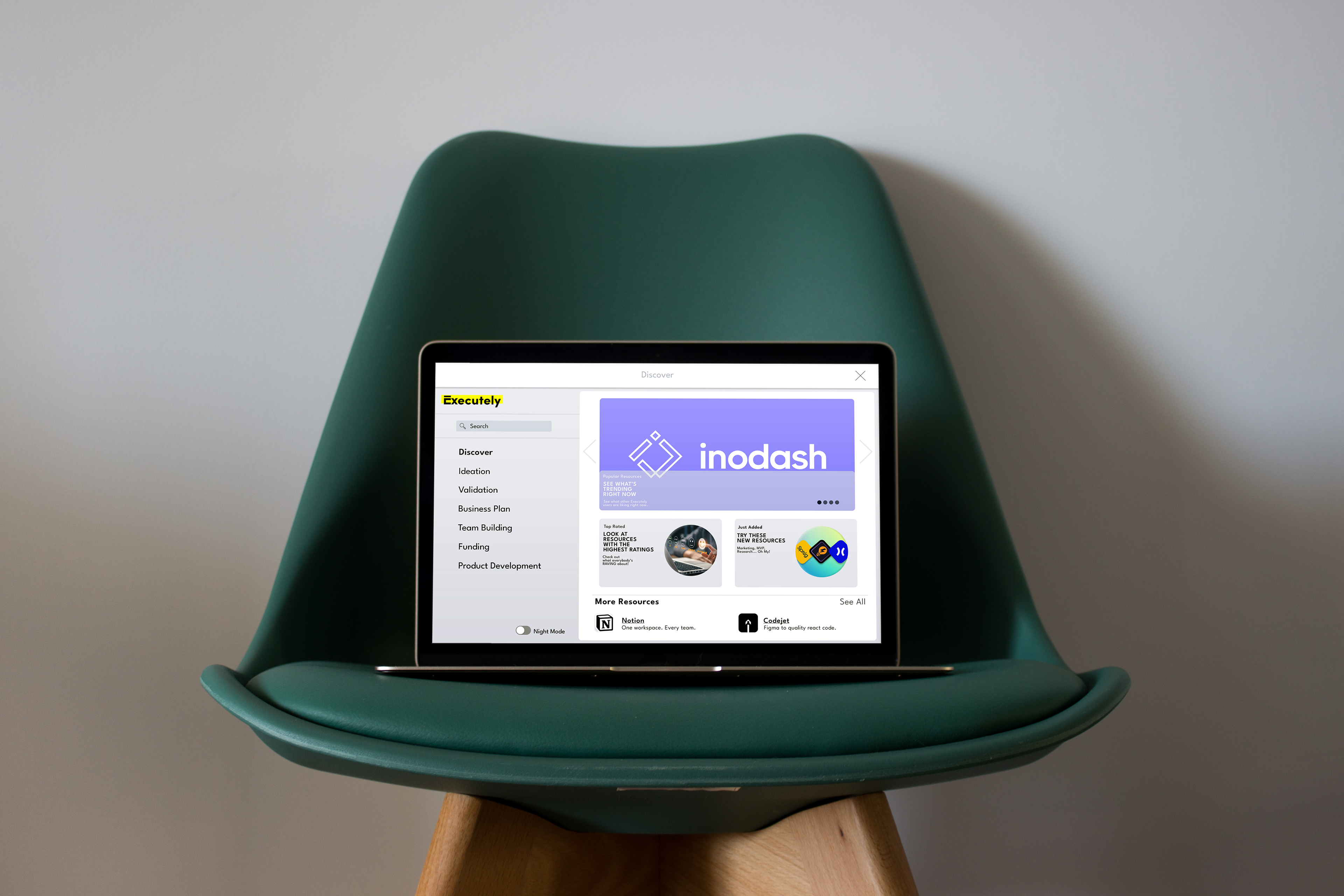
Taking these insights with me, I then made low fidelity thumbnails of prospective ideas. Since I was in charge of the newly added resource center, a space that did not exist before within the product I was able to be more creative and take inspirations from already existing products like Apple, and Shopify.
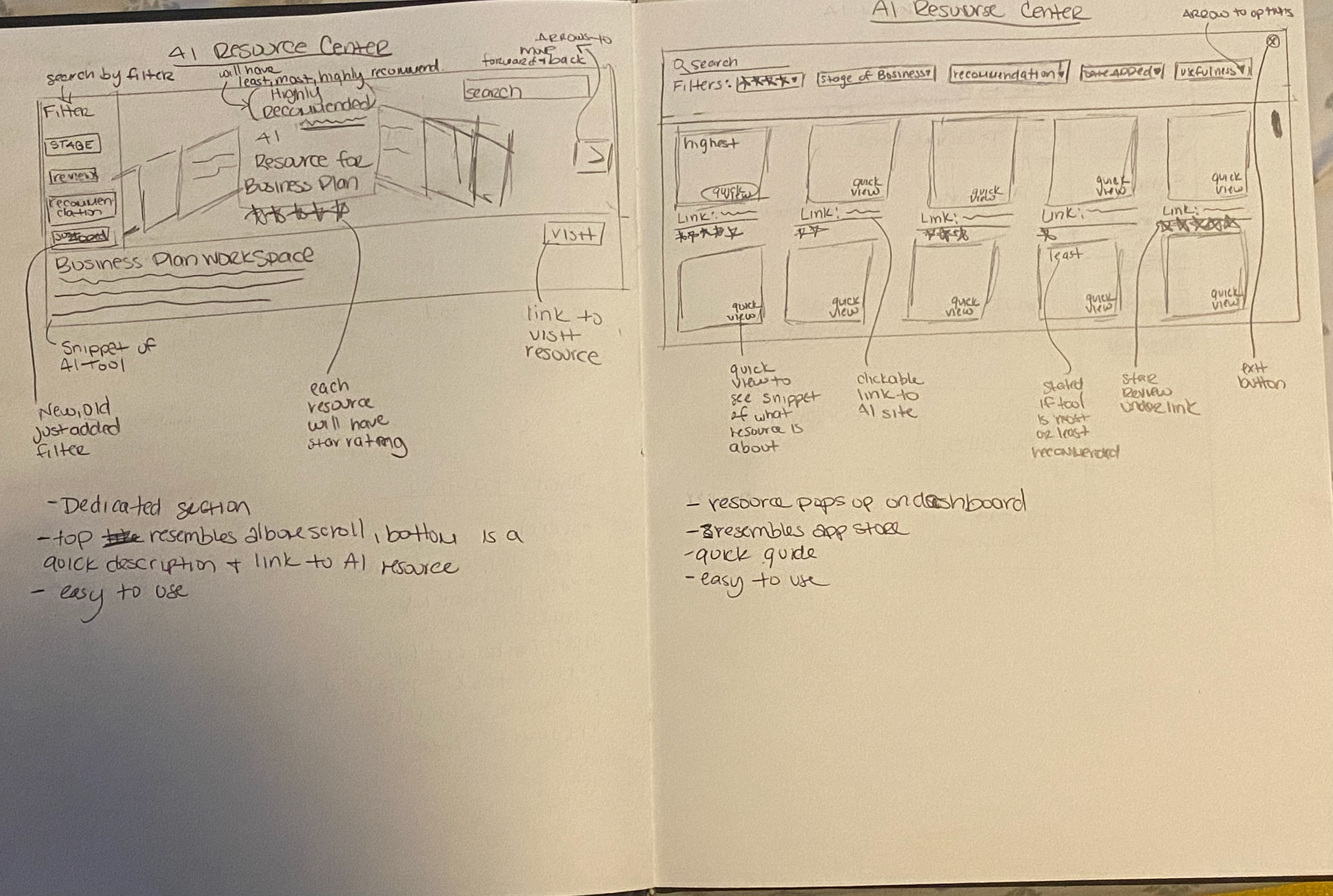
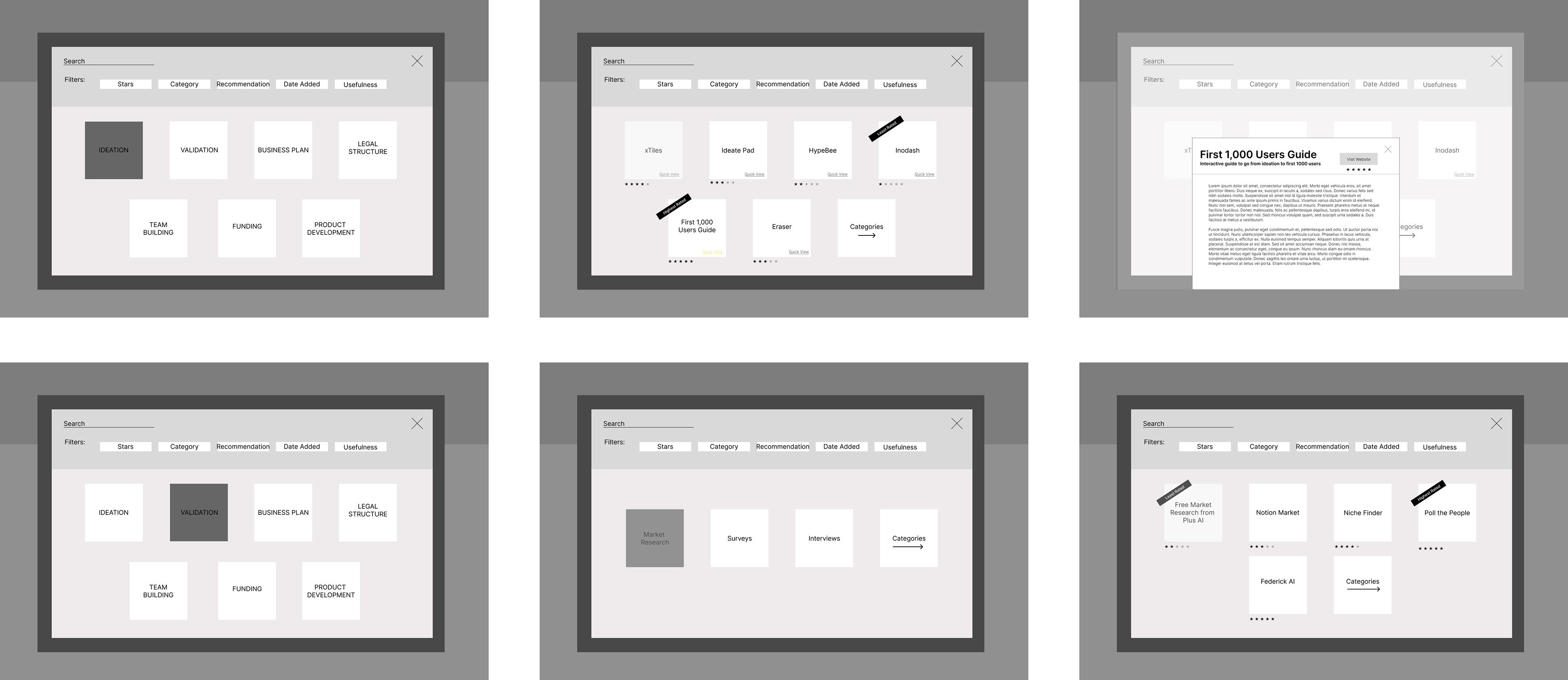
After, sketching out the thumbnails, we then moved on to mid fidelity wire frames. My original ideas were simpler in style but more complicated in experience. The user had to go through more clicks, or had more routes to take than needed to get to the same destination.
When I had come to this revelation I was already designing the high fidelity versions, but the ideas were just not translating. This is because I was trying to reinvent the wheel. While I did look at inspirations from sites like Mobbin. I wasn't really looking at why theirs were successful but mine wasn't. After a call with the UX researcher of the team we were able to pinpoint the issue.
The Problems:
1. I was confining the space I was given to only a pop-up and not a full page.
2. While the original ideas had been done this project needed a scaled down version. My thought process was world building while in reality it needed to be short story.
3. Time was a huge factor. The internship was almost done and my part of the product was not. This was a stressing factor.
How I solved it:
1. I let go of my original vision. I did not need it and it no longer served my purpose.
2. I re-grouped and went on the lookout to see if I could find the successful version of what I was trying to do. I did.
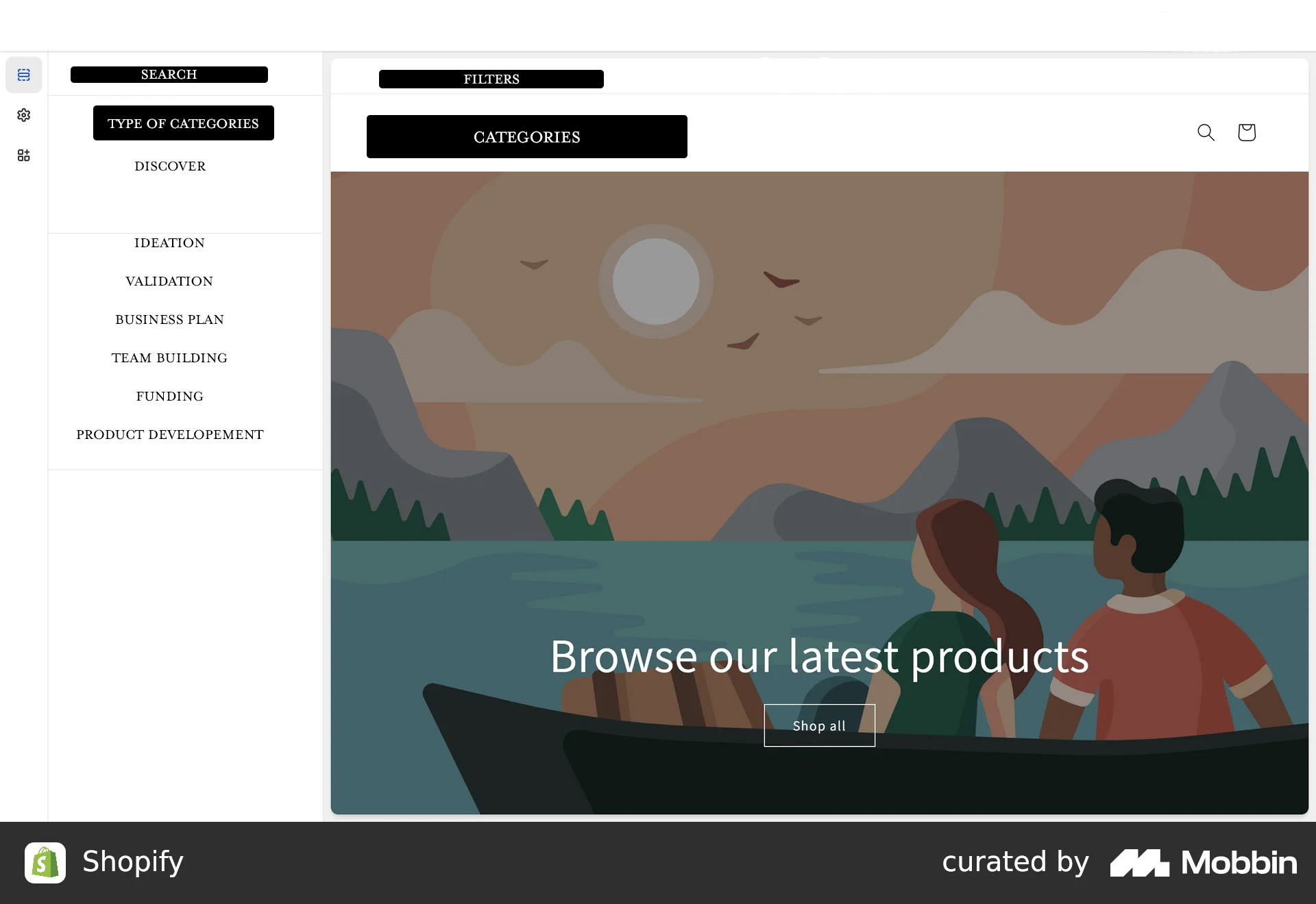
3. I then downloaded a dashboard from Shopify that I found on Mobbin. I left the design but erased the information and replaced with my own to give myself an idea of what I wanted.
Shopify was not my only inspiration, there were details inspired by Apple's desktop app that I was able to successfully translate as well.
This helped me create a product within a product that not only was visually appealing but was a user happy experience.