Yogi Bunny is a Ayurvedic Hippie lifestyle Brand and start-up. I was tasked with creating a logo, and branding.
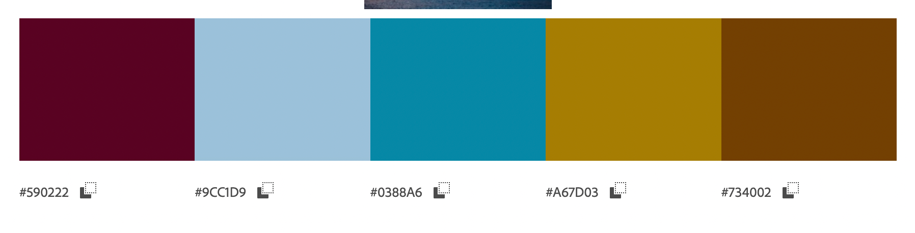
Because this is a South Asian owned company, after I did research on traditional designs and colors. I started with colors first. Colors like these in the South Asian community are prevalent not only in photographs but in patterns I was able to find. Starting with colors helped me more than design first.
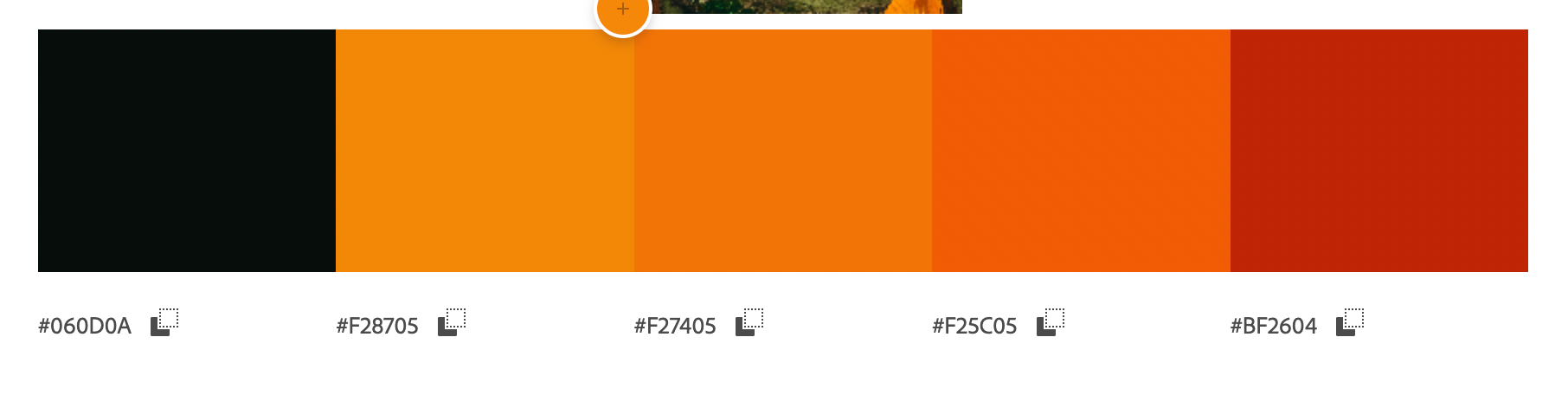
The top color palette isI used the last four colors and the bottom I used the first two colors. I wanted to use colors to represent the region but not have it look cheesy and stereotypical. I wanted a classy and "hippie" look. Mixing light and darks to the extremes helps to communicate this.
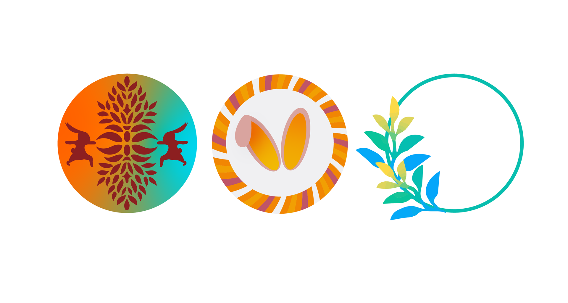
With the idea that the name was Yogi Bunny I wanted to play with the idea. As seen in my first dew ideas below, I first thought an iconography logo would be best first. These ideas didn't work out because they weren't sleek, refined or simple enough.
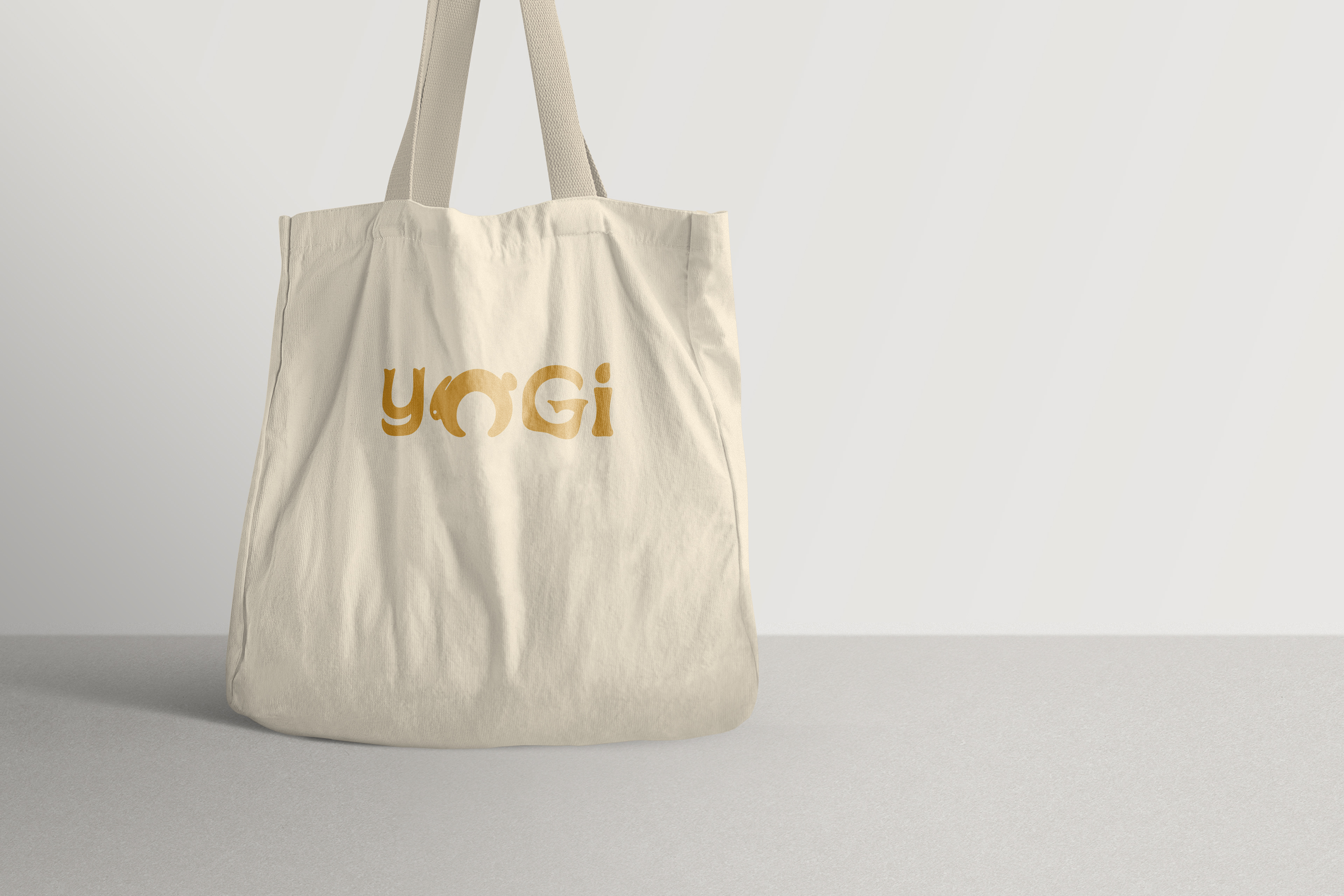
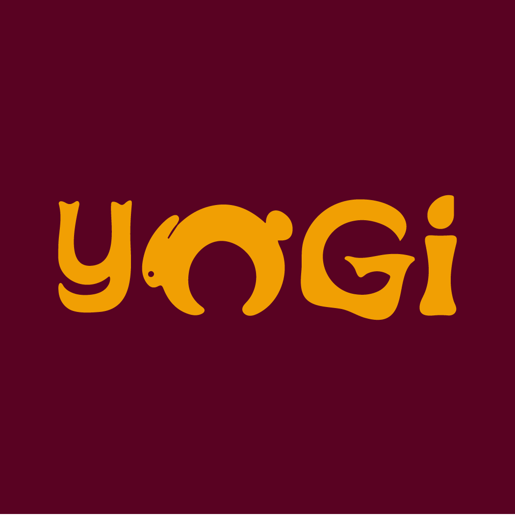
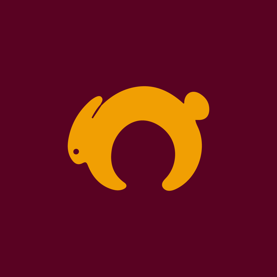
Being partly inspired by the Starbucks logos and a few critiques I was finally able to come up with a logo design that is both an icon and type. To help give the "hippie" effect I also made the letters swiggly for a groovy feeling.
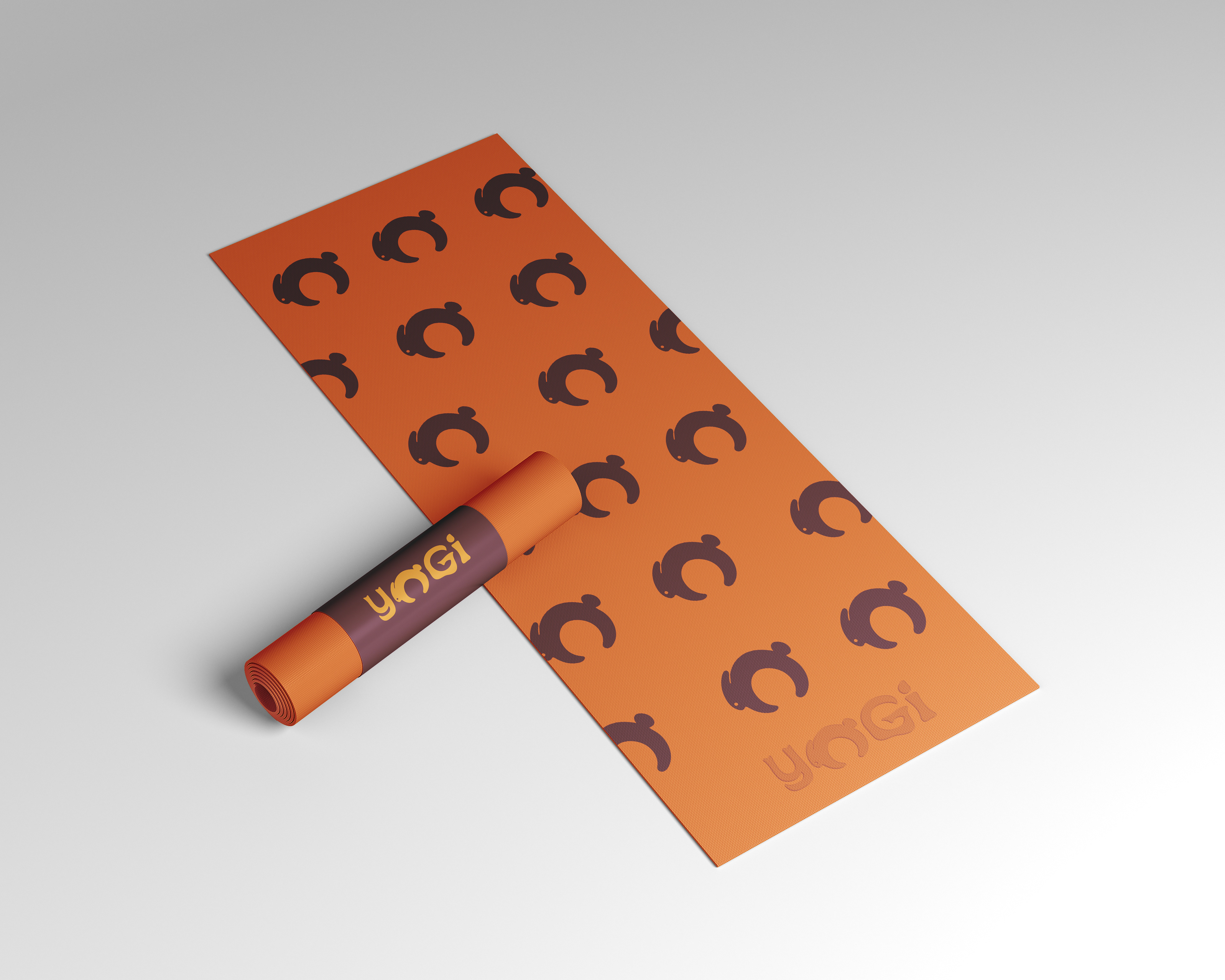
I then isolated the leaping bunny and made that the secondary logo. I felt the secondary logo was great for brand recognizability.
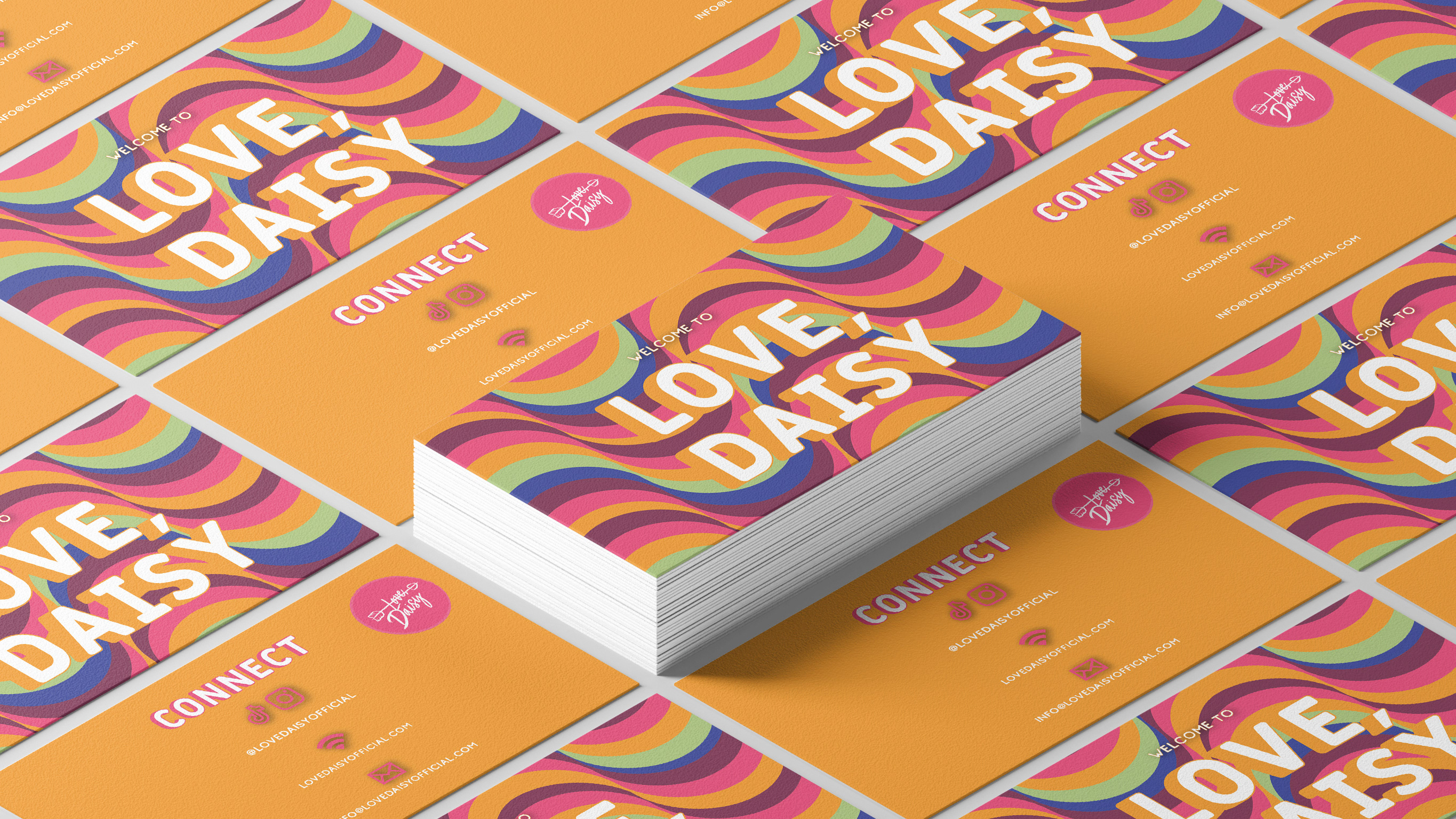
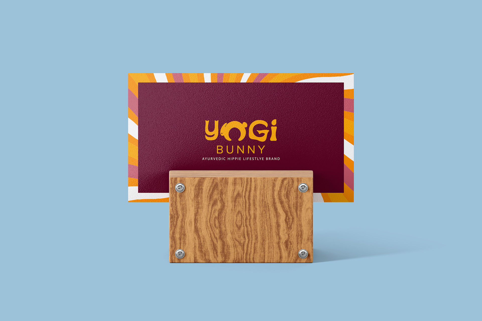
I wanted the business cards to feel fun, energetic, and bold. I also wanted it to be functional. Using a secondary palette I made a background, and used the primary palette for the functional aspect of the card.
Some of my favorite parts of the project was being able to add the logo on products such as the tote (below) and the yoga mat (first image above)